Everything is based on the visual weights, that is, the things that gets the attention of our eyes. This is based on the human psychology and our way we equilibrate images and shapes to understand what we see.
Thus, the visual balance – imbalance can be generated by knowing how the graphs elements affect human psychology. For example, we can balance a composition by repeating visual elements throughout the visible plane, so that these visual elements generate stability because they gradually support the eye on all of them, they get the attention equally.
To generate imbalance there are many ways. For example, you can put an item as the unique and stronger in the plane, so it will contrast with the rest of items. But the imbalance, however, is created when multiple items are attracting our view ate the same time and this causes tension.
The most dificult is to generate balance or imbalance that we need with the differents visual elemnts that we use in the picture.
Here I expose certain types of equilibrium, organized and based on: location, color, shape, texture and degradation.
TYPES OF VISUAL BALANCE
1. Balance – Position of the heavy elements in the plane.
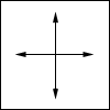
1.1. Visual axis. The axial equilibrium is one that has the stability of the vertical and horizontal axes, that are actually present in the composition and forms.
The balance of the positions is based on human psychology that recognizes as balanced a horizontal plane and also a vertical line. These are the basic pillars of stability and visual balance. The inclined forms generate a movement that unbalances the composition and this attract more attention and it´s stressful for the eyes.
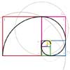
1.2.The unity. The radial equilibrium is generated with the elements of unity, which have the most weight and therefore attract the remaining elements that are organized according to him.
And it´s also based on the fact that the spherical shapes have equilibrium in a plane by themselves, because they are concentrated, rotating, concentric shapes (rotating themselves inward).
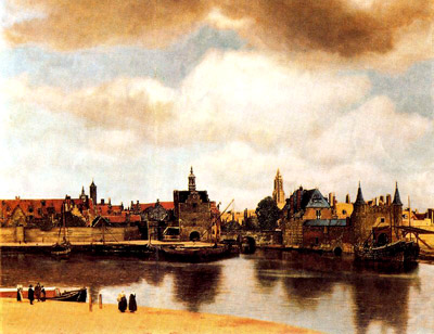
View of Delft painted by Vermeer. This image has a strong horizontal axis with the village, boosted with the sky and the lake that are tonally clearer.
2. Balance – Colors. Color and tonal harmony.
It is based on the knowledge of the full color wheel and knowledge to distribute the colors in the image plane.
On one hand, harmony depends on relations between complementary colors (complementary colors) or adjacent (same range). And moreover, on how the colors in the same range or identical are located throughout the image or where. When a color is all over the work, generates a balance, because in any area attracts more attention. However, if prevalent in a place, generates a point of attention to it.
The color balance directly affect emotions and connotations that the predominant colors produced in the viewer, unbalanced colors or generates tension in the image.
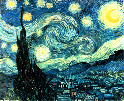
Starry Night by Vicent Van Gogh. Tension and harmony generated by the yellow dots that are all over the sky. The view goes from one star to another and stabilizes the composition.
3. Balance – Shapes. Size hierarchy.
The relationship of size between the forms that exist and have been defined by the lines, the colors, by the texture of a material, or any way, and that generate a shape, or even generate united shapes.
The size and the position, relative to the set, generate equilibrium if all have the same power of attraction, and on the other hand, it will generate the imbalance if there are larger and more striking elements in space.
This type of balance / imbalance in the forms promotes the ideas and thinking about the work.
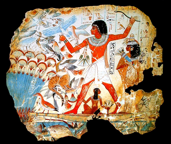
The hunting. Egyptian art. In this composition the more important figure is the Pharaoh, ideologically. This draws the eye and everything towards him.
4. Balance – Textures. Plasticity and sense of touch.
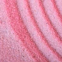
The visual textures and the materials generate a type of attraction of the look, and therefore, they have the ability to produce a kind of balance or imbalance in the image. If the same texture is repeated throughout the image, it will be balance the composition. But if there is an element with a texture that contrasts with the rest of elements and textures, then this call more attention and it will be imbalance.
This type of balance or imbalance also has the ability to arouse the viewer’s tactile sense.
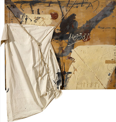
The painting “Tapies” captures attention on the fabric that works as a real texture and visually powerful. The imbalance consists in how the view falls to see the fabric.
5. Balance – Degradation. Visual changes.
Relations between the similar graphic elements against the different graphic elements generate visual transformations, generates narratives that the view will make by looking the image.
The balance, as it meet these related items, it will depend on the degree of the change and of the contrast between the elements, if they are more or less similar.
Color gradients, gradients tone, shapes repeated rhythmically and that move to another form, the textures moving towards other textures, and so on .. balance the visual changes. In the contrast and in the confrontation of different visual elements there is no gradation, and therefore, there is a kind of imbalance caused by the change.
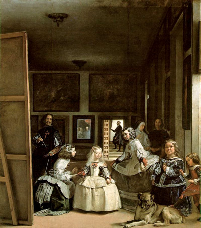
Meninas by Diego Velazquez. Gradients within the space gently absorbs elements set to attract harmony, stability and balance.
Conclusions
The game between the search of balance / imbalance and the presence of contrast / tension between the elements is one of the more complex tools and you need to understand the image to produce the work we’re actually looking for.
Of course, balance – imbalance are neither good nor bad in themselves. Depend on the personality of the author and the viewer. Each person, according to his personality, will find nice the balanced or not, something that corresponds to his mind. So, there are people who finds balance enjoyable, and others find it disgusting.

